Wednesday 30 April 2014

Precedent 1: Medieval Castles

The feedback that I received from Kate regarding my ideas and drawings post-break she felt that I was taking a post apocalyptic approach to this project. How climate change is going to affect the area of Naenae as my previous post explains.

Playing off the idea as a post apocalyptic house and how it will stand the test of time, the first thing that pops into my head as being a place of security are medieval stone castles and how they were supposedly impervious. Therefore I have begun to look at different medieval castles and their respective structures to help give me some possible ideas.


Castle Neuschwanstein at Schwangau, Germany.
Burg Steen, Belgium.
Bran Castle (also known as Dracula's Castle), Romania. 
Kalmar Castle, Sweden
Chillon Castle, Switzerland.
Kreuzenstein Castle, Austria
Palace of Pena, Portugal
Castel Nuovo at Naples, Italy 
Caernarfon Castle, North Wales
Location:
It is clear that each of these castles even though they are from different countries and from different times, the location of which each castle is built is similar. In order to help make it easier to defend the castle if needed be, these castles have all either been built on a hill or on / or next to water. 
Building my house would not be practical to build on water or create a moat around because the only intruder I am designing to with stand is climate change. And unfortunately due to the terrain of Fisk Street, Naenae, I do not have the option of building my house on a hill. 

Materiality:
Each of these castles look to have been built from similar materials. If I was to gave a gander, I would presume it would be made out of stone or rock. 

"Rock structures have existed for as long as history can recall. It is the longest lasting building material available, and is usually readily available. There are many types of rock throughout the world, all with differing attributes that make them better or worse for particular uses. Rock is a very dense material so it gives a lot of protection too; its main drawback as a material is its weight and awkwardness. Its energy density is also considered a big drawback, as stone is hard to keep warm without using large amounts of heating resources." - http://en.wikipedia.org/wiki/Building_material#Stone_or_rock

This could be an option for my house due to its protection and its ability to stand the test of time. However I must keep in mind the amount of energy needed to heat the building if I were to use stone or rock. Adding to this, I will also need to think about the possible tenants of the property and whether or not they would be able to afford it?

Monday 28 April 2014

Diagrammatic Analysis via Colour Coding

An exercise we completed today was to distinguish the contrasting spaces within a floor plan that we were given. The spaces we were meant to distinguish were:

  • Servant vs. Served Spaces - i.e. Task orientated and leisure orientated spaces
  • Public vs. Private Spaces - i.e. Where visitors are encouraged or discouraged to go to
  • Outside vs. Indoor Spaces 
  • Enclosed vs. Opened Spaces
  • Wet vs. Dry Spaces
  • Noisy vs. Quiet Spaces

The following are scans of my colour coded floor plan with the distinguishing of the contrasting spaces:


The next part of this exercise was to reconviene as a group and discuss the differences and similarities between our different floor plans:

Josh, Ethan and I had floor plans that were similar in the fact that the bedrooms were separated from one another. In the case of Josh's floor plan, we believe that it is a Victorian mansion that distinctly had servants working on the premises. Not only was the bedrooms but also the whole house was almost as if it were segregated down the middle where the servants and children where at one side of the house and the master bedrooms and main living rooms where at the other. This was then emphasised by what we believe are lower ceilings in the servant and child quarters.

Ethan's house was a elongated one storey building of which the master bedroom was at the far end of the house and the guest bedroom next to the study (which we believe may act as more of a sitting room with a fold-out bed) was at the other. I believe this is to give the owner of the house privacy from whom was to be a guest in their house.

Lastly my bedrooms are somewhat separated also. However I feel that it unlike Josh and Ethan's examples, I do not feel like this was intentional to avoid contact with children or slaves for example, it was more of a case of simply balancing the structure of the house. To make it symmetrical if you will. The dining room, kitchen and living room are central elements to a house and therefore are central to the house I was given.

Our floor plans contrasted with Finn and Rachel's of whom their houses had the bedrooms all in close proximity to one another. This infers a tighter, family orientated home in which the occupants (especially if there are young) can feel safe and secure knowing that one is close to others incase anything was to ever happen.

Because my house is aimed a holiday home, it has a greater sense of open floor living and a strong indoor / outdoor flow than the other examples of my group. My house is build on a large deck and has been opened up so that the house is in three sections unlike the norm. This is basic yet an interesting concept with regards to the spatial generator word Kotikoti. I have this generator word, so I will use this example as a precedent to possibly influence my designs throughout this project.

Sunday 27 April 2014

Initial Idea: Over the Break

Over the break we have been asked to come "back [with] an analogue or digital thing, based on your ‘spatial generator’, which you can explain as a ‘diagram’ of the issues you see as most important for this project (in reaction to the reports we discussed), and an idea on how you are going to work on this project."

Unfortunately I have been in the Gold Coast for most of the break therefore my 'thing' is a few sketches of an initial idea of how I could design a house portraying my spatial generator term kotikoti. 

The following are annotated scans of my initial ideas:

A scan of all of my little sketches outlining different elements of my initial ideas. The two main things I have based my design on are making my house sustainable, and keeping in mind the inevitability of climate change and how it will affect the Naenae region. Because the Hutt Valley is a flood risk due to both the Hutt river and Wellington Harbour, water has played a big part in some of my ideas.
This is a plan sketch of how my house may look like. I have taken my spatial generator term Kotikoti and implemented it by cutting my house into sections all connected through a series of glass hallways. The main section of the house will consist of an open planned kitchen, dining room and living room that can be closed off through detachable sliding doors. The dining room will have a large bifold doors that will open up into a small patio area that is sheltered from the elements.

The two side wings of the house will be similar in which one side will consist of two bedrooms and a public bathroom. Whereas the other wing will have the master bedroom, an ensuite and a walk in wardrobe.

The top coned shape will be a two storey, 360 degree conservatory / sun room so one can sit back and enjoy the surroundings around them. From this room there will be an exit onto the tops of the glass hallways where they will have vegetable gardens or personal grooming gardens. These will be sheltered from the wind from the high pitched roofs on the wings. These gardens, as you can see from the scan below, will have hand rails running the edges of them in order to stop occupants falling off.

Lastly in the centre of the house there will be a water catchment which will act as an interior water feature as well. There will be a slight slope in order for the water to run into the tube in the centre, down through the interior of the house, before being distributed to parts of the house in the pipes underground.
This is a sketch to portray what the top of the glass hallways may look like with a garden and handrails. 
This sketch is showing how the roof pitch will work on each of the wings of the house. The gutters will also gather rain water and will be distributed throughout the house. 
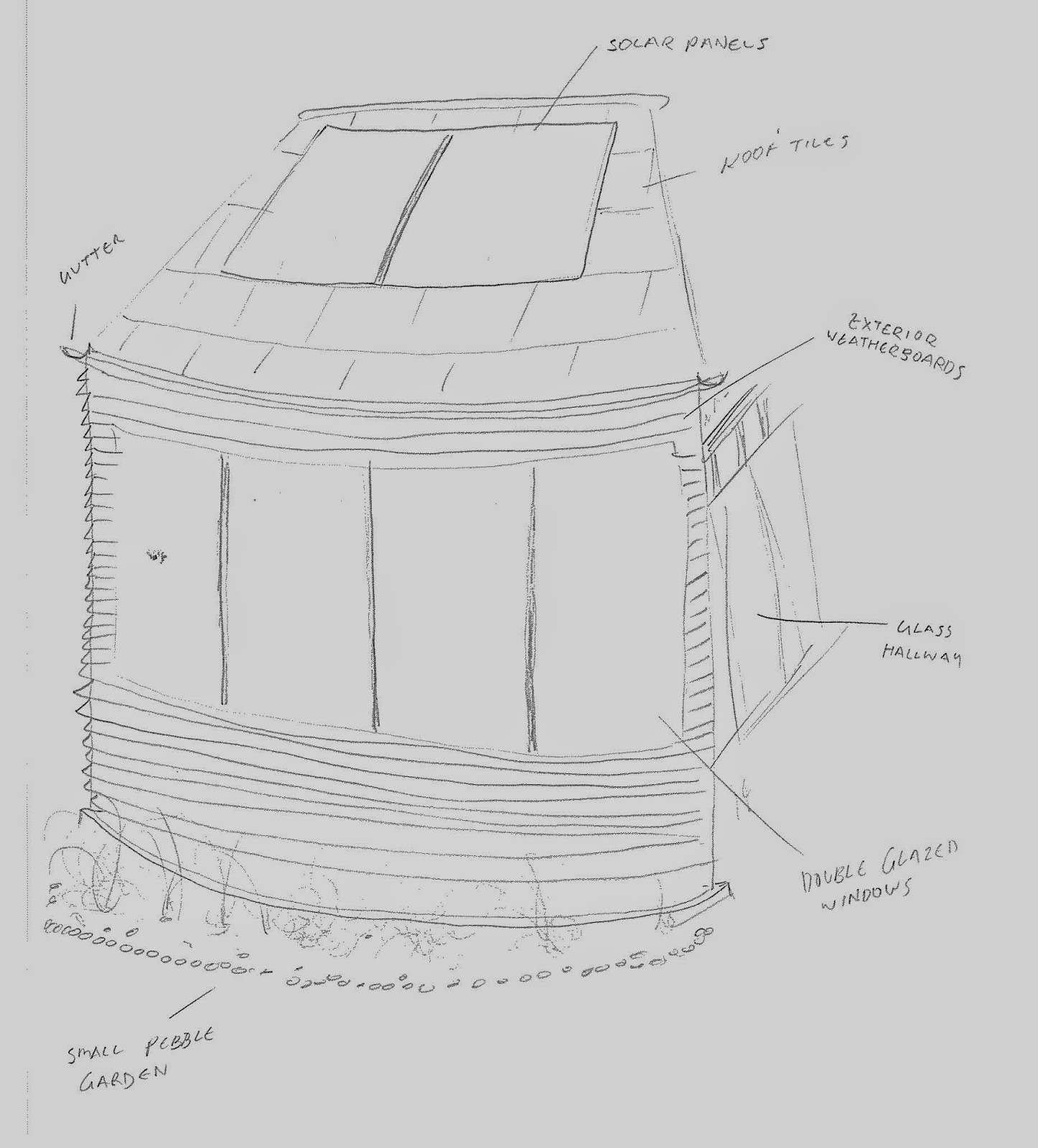
This is a sketch showing the possible exterior for each of my house wings. It would consist of large double-glazed windows for warmth, native timber for exterior weatherboards, generic roof tiles and solar panels.

Lastly, due to the fact that the Hutt Valley is a flood zone, I will be raising the house on its foundations. In this space that is created, a bore water catchment system would be installed to gather excess ground water and distribute it to outdoor garden taps etc. for water plants for example.

Tuesday 22 April 2014

Spatial Generator Term: Kotikoti

According to the Māori Dictionary: 
http://www.maoridictionary.co.nz/search?idiom=&phrase=&proverb=&loan=&keywords=kotikoti&search=

1. (verb) (-a) to cut to pieces, dice, divide, lay out boundaries. 
Kātahi ka tīkina he kairūri, māna e rūri, e mapi, e kotikoti kia hia rānei pīhi (MM.TKM 30/6/1857:3). / 

Then send for a surveyor to survey the land, map it and divide it into allotments.

My spatial generator term is Kotikoti. I must design a house that incorporates elements of the above definition. We have been told that we have free range on this project and therefore I can interpret how I portray this within my design.

Thursday 3 April 2014

Post-Presentation Changes

An element of my work that I was told to improve following my presentation was my orthographic drawings. I was told that for my plan drawing I needed to include the paved, water area that is outside my viewing room. 

I have done this and rendered it on the computer as close to the original that I could muster. It turned out as follows: 

*Note the teal lines on the close up screen shots are guides in order to make sure that my paved out door section drawing lined up with my plan drawing. 


Evaluating Our Peer Presentations

A task that we were set during final presentations yesterday was to make notes and evaluate four of our peer's work and put it on our blog. Mine are as follows:

Janoo Patel:

Janoo's client was Rachel Baker and her ritual was the experience itself of mountain biking. Rachel asked for a place where she could use as a workspace, however use it as a storage area for things like her mountain bikes. Janoo created multiple models branching from the framework of her aesthetic gesture in which she used wire as inspired by bike spokes, to create a geometric gesture of a Rachel's favourite mountain bike track.

She experimented using the form of facet sheets to create a structure with the underlying essence of the outdoors. She has incorporated a grass floor throughout her space as well as wooden textures and a glass roof in order to help experience this idea. The angular facet forms branch from the walls as well, works as storage too. The perspectives she displayed in her presentation were clear and helped one understand the layout a lot better and how one would inhabit the space. Overall this design is quite unique, and I feel that it meets her client's needs and desires well, however for me with all of the angled facet walls both in the interior and exterior, making it safe would be a major priority.

Natalie Harris:

Natalie had a very interesting presentation and design as well. Her design was based on watching planes fly overhead in which she has designed an exhibition room of transparent tubes filled with L.E.D lights that mimic and trace flight paths. This is a very cool idea in which I feel she portrayed well especially as the exhibition room could be inhabited or simply viewed from afar through the large glass panes that encapsulate the space. The only question I have for this design, which I asked her in her presentation, is how she would consider powering the L.E.D lights as most of them do not reach the roof, and every one of the transparent tubes run outside. Therefore more thought is needed in order to create a way of powering the lights. Solar panels at the end of the tubes?

Emma Solomon:

I loved Emma's design solution to Jess's minimalist approach to a bedroom. Her concept was all focused around the contrast between Tactility vs. Transformability. She achieved this by adapting the bedroom structure so that for example a wall transforms into the main table. She has exceeded the minimalist idea using under floor storage for hiding away elements of the bedroom that are not needed at a particular time. A good example of this is designing the Jess's wardrobe so that is extends out and becomes a curtain. 

Honestly I do not have anything I can think of that I would improve or refine to this design as I feel that it is a great example of a practical, functional, minimalist bedroom.

David Argue:

David also had Rachel as his client in which he took a different approach to Janoo in how he approached the design. He wanted to break down the idea that a room is four walls by literally breaking down the four walls and morphing his space in with the landscape and thus blurring the line between interior and exterior. Because on a mountain bike track is uneven ground, he distorted the form of the walls and floor to emulate this idea. Overall I feel this is a unique and an interesting take on portraying mountain biking which I feel that he has expressed well. His video within CryEngine made one feel as though they were racing through his model as if mountain biking themselves which I found quite moving. The main thing I would do, as Kate expressed, would be putting a ceiling on the model in order to make it convey the idea that it is still a space as opposed to being part of the landscape. 

Wednesday 2 April 2014

Final Presentation

This post is simply each of my presentation pages. Because I 'rolled' with it on the day and made up what I said, I do not have any notes or writing that goes hand-in-hand with this presentation.


Orthographic Drawings

A part of this project and hand-in is creating orthographic drawings at a scale of 1:20. I have never done technical drawings before therefore I did it as best as I could. I did not anticipate how big my drawings were going to be..

My first images are my orthographic drawings that I have rendered using watercolour paint. I decided to use a ink pen in order to darken the lines and make it clear where each timber floor boards are to be, or the difference between my step seating and the actual steps. Unfortunately while I was doing this, my pen decided to keep bleeding and leaving ink all over my rendered drawings. 

I have spoken to Kate and she has suggested that I scan my drawings in sections and put them back together on photoshop. This allowed me to create more space between my drawings, and also touch up on my drawings from where my pen bled. Therefore the second set of images are after I had touched up my drawings using Adobe Photoshop.


On this photograph, you can see how the paper has crumpled when the watercolour was added and then was creased. By scanning into Photoshop I would be able to print out without these creases. 
A close up showing some of the bleed that occurred when I was ruling my lines and then being on my ruler which got smudged on other parts of my drawing.


The following are images following using Photoshop to additionally render and touch them up by removing accidental flaws.